Braemar Hotels & Resorts
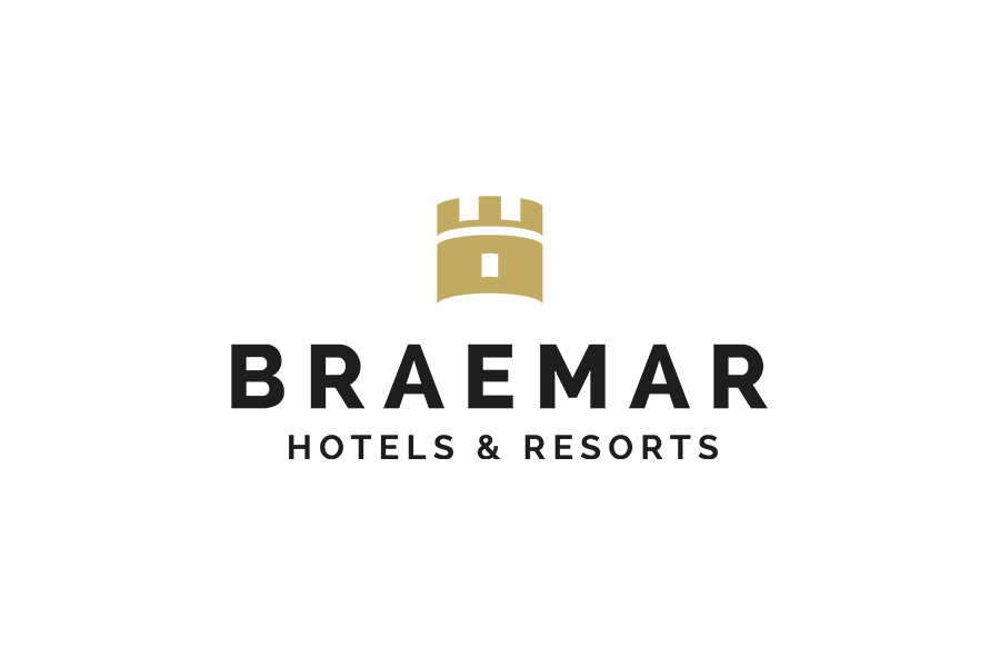
The logo came about as a result of a design competition. It was designed for the rebranding of Ashford Hospitality Prime to Braemar Hotels & Resorts. They wanted a symbol to represent luxury, stability and strength. They changed its name from Ashford Hospitality Prime, Inc. on 24 April 2018.
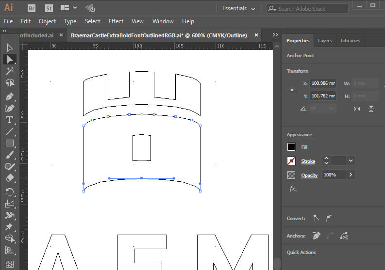
Braemar castle itself provided the castle turret idea. As a result, the design needed to be elegant and simple. The final look didn’t deviate much from my initial design. A tweak of window alignment and that was more or less it.

The actual castle in Aberdeenshire features an number of rounded towers. When the castle is viewed straight on, five battlements are in view. But, using five looked too busy. I reduced this down to three. As a result, this would ensure the logo kept its detail when used on a small scale. The letters of the name Braemar are in capitals. This was to reflect the shape of the tower icon. The spacing was to mimic with the spacing between the battlements.
Unexpectedly, my logo appeared on the screens of the New York Stock Exchange. The Braemar Hotels and Resorts owners are seen ringing the closing bell. Certainly this is the first time a design of mine has had such a wide audience on live TV screens. The owners knew what they wanted as a final result. Consequently their feedback was very helpful and concise. It is always a great help when a client knows what they want. This avoids needing lots of variations as minds are changed.


