International Ballet Grand Prix Singapore
Singapore Ballet Logo design process. International Ballet Grand Prix Singapore is the first and only international ballet competition in Singapore. The National Arts Council of Singapore supports the venture plus the non-profit organisation who organises it. The competition’s aim is providing educational platform for ballet students from all over the world. Furthermore, it strives to give the students freedom to learn from other dancers of all abilities and backgrounds. The organisation wanted a new logo design.
Generic logo design
The client wanted a sophisticated and mature ballet logo. Above all, the logo had to put Singapore International Ballet, namely the Grand Prix, on the world map. They didn’t want generic cliché images.
If you Google search Ballet Logo, more often than not the results show a figure(s) or ballet shoes. If you search ‘dentist logo’, a tooth will be the main item. Search ‘health and wellness logo’ and it will have a leaping figure. A search for ‘estate agent logo’ will have the over used four pane window in there somewhere.
Lightbulb moment
The idea was to think outside the box knowing that using a figure was out of the question. As a graphic designer, the hardest thing is being original. Also, how could the logo put Singapore on the map as the most prestigious ballet competitions in the world?
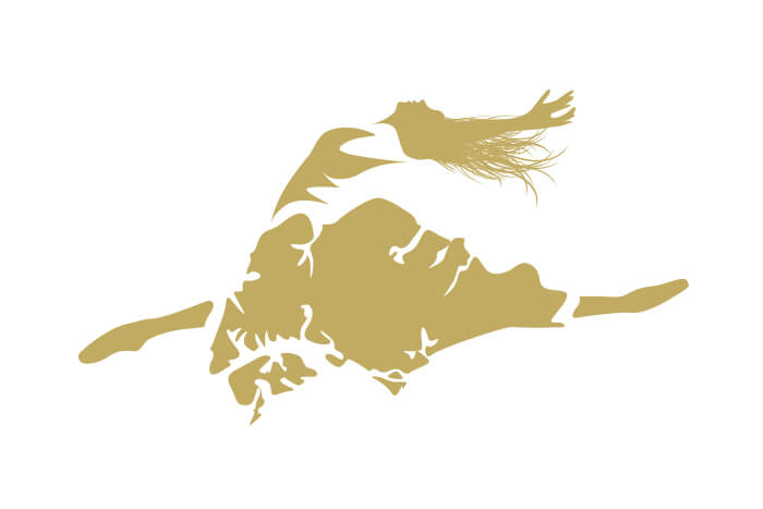
There was my idea, the MAP of Singapore.
The outline of Singapore immediately reminded me of a ballet dress in full flow with lots of folds. I rotated the map upside down so it resembled a dress even more and fitted the limbs better. As a result, it didn’t seem immediately obvious that is was the map of Singapore. We normally view maps north to south, so that wouldn’t work. Furthermore, the client didn’t want a ballet figure logo, so how could the map be used?
It was obvious that the map as a dress wouldn’t work unless it was part of a figure. But I thought the idea was so strong, maybe the client would allow it. Taking the decision to use a ballet figure was a thus big step.
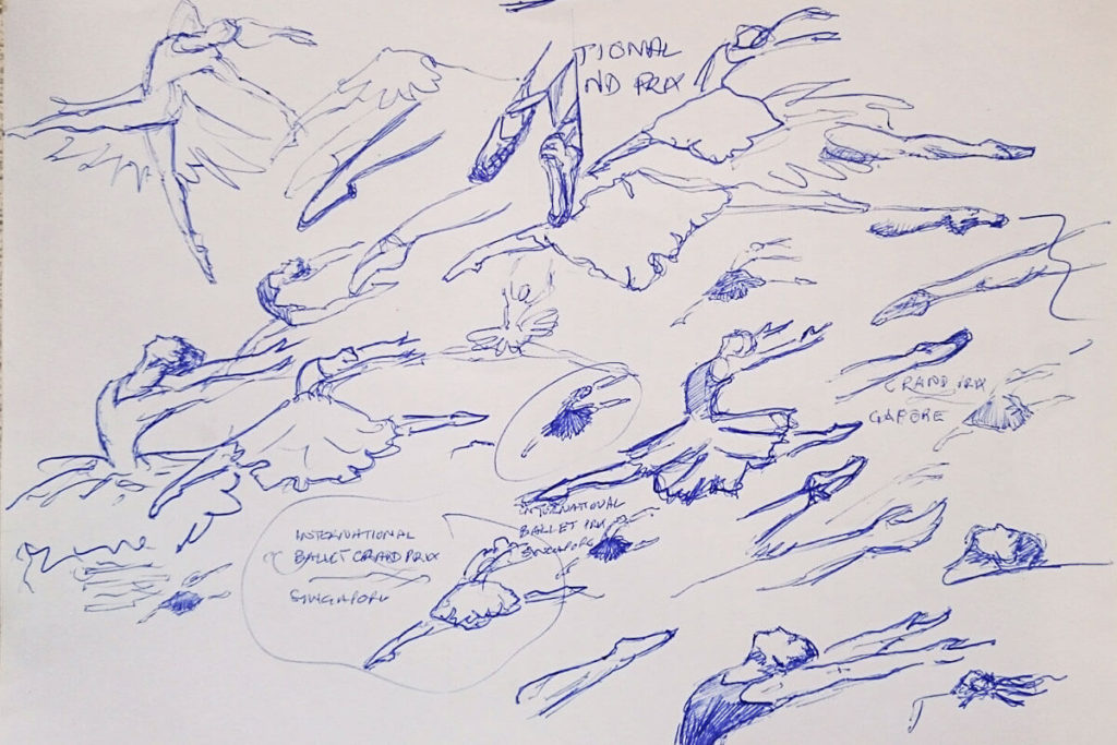
Doodles and scribbles
So, it was doodling time. When I create a logo design, I don’t draw directly onto screen. I take a pen and and paper and start to scribble ideas out. Sometimes a quick slip of the pen makes a line or shape that introduces an idea not previously thought of.
Various drawings of figures and poses. I find it best to ‘speed draw’, just taking things where the pen goes.
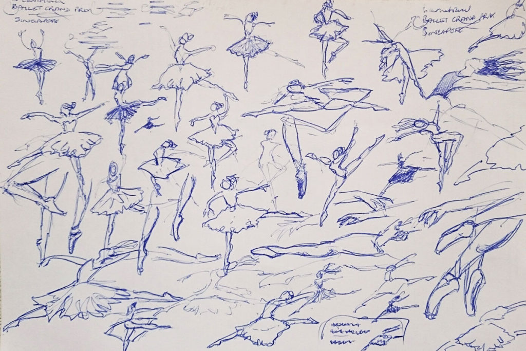
Seen in the images here, there are lots of scribbles and doodles developing ideas. When I have a few finalised ideas, I will draw them properly using Adobe Illustrator and assess how they look. I find drawing first saves time in developing logo design ideas.
Tweaking
With the ballet logo, the outline of the map was pretty much set. The only decision was how accurate to make it. The other decision was how the figure would look ‘posewise’. I searched for various ballet poses and scribbled them down. To me, the most dynamic pose was the ‘grand jeté’. This is a big leap with a leg-split. I selected a suitable image as a template to draw the figure.
The idea was to put Singapore on the map, literally. Consequently, I wanted the map to feature prominently. The best way was to fill the map with a solid flat colour. If the figure appeared as solid shapes, they would compete against the visual strength of the map. Therefore I used minimalist lines to suggest the figure. They would be smooth and simple in the same style as the map outlines.
Designing logos with Typefaces
This is always a big decision when designing logos. In this case, the client wanted a san serif font. It was to be bold, clear and easily read at all sizes. The logo was for backdrop projection on a stage. Also, printing on posters, leaflets, tickets, programmes and in all forms of social media. The other direction they gave was emphasising the words ‘Ballet Grand Prix’ and somehow introduce ‘nature’.
The first was simply using the bold version of the typeface. A couple of plant tendrils represented nature. These are graceful shapes and curves in harmony with ballet movements. I avoided going in to the area of leaves and flowers. This stopped the logo from looking over complicated.
The client wanted a ‘landscape’ logo shape initially. So the figure appeared to the right of the left aligned text. With no preference given to colour, I chose a gold for the dress and figure with the text 90% black. This was as far as I could go developing the logo, I now needed client feedback and thoughts.
Logo design client feedback
When designing anything for a client, patience is a great virtue to have. The client knew what they wanted, but didn’t know what they wanted until they saw it. As a result, a long proofing stage took place. They loved the map and figure idea because Singapore itself featured in the imagery. So ‘no ballet figures’ was now not an issue. Great. The logo design was on its way.
They were so excited with the logo, it sparked ideas of how the map/dress and figure should look. They wanted to see different solid colours plus combinations of colours and gradients. Then effects like watercolours and textures in various colour combinations. Consequently, around thirty different designs resulted. It was difficult for them to choose which one they liked best. The reason being because they had a team of people all voting on their favourites.
This is always something which can happen. Only when the client sees a proof, that their ideas start flowing as to other possibilities. It is always good to go through this process if this is the case. The reason being that the client knows they have chosen the right design in the end.
Some of the different versions before changing the figure to lines rather than solid shapes. The figure was to portray a more formal dancer so the flowing hair was eventually removed.
Final decision
So, after viewing all the variations, they selected the very first gold version. I liked some of the suggestions they made. I particularly liked the watercolour version in blue and pink. They said the gold portrayed a more professional look and would fit better with how it was to be used. With the decision made and some minor tweaks, I supplied the finished design as vector, jpg’s and PNG files. They requested a white version as well for black or dark backgrounds. The Singapore Ballet Logo was complete.
![]()
There is never a right or wrong way to design a logo. It depends on numerous factors. Every situation and brief is different. I prefer to doodle ideas on paper first while other designers may go straight on to the computer. In the end, it doesn’t matter how you reach the solution as long as the client loves the end result.