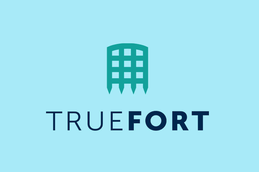
Truefort
Logo design
Truefort required a new corporate logo design. They specialise in real-time application and cloud protection based in New Jersey, New York. Their field of work is in the complex world of cyber security helping protect companies from cyber attacks and data breaches. As a result, they needed a simple but effective logo design representing what they do.
Simplicity is they key to a logo. Shields was one train of thought, but it was an obvious choice. I like the idea of seeing a company as a castle. Large corporates often prefer a very minimal approach to their corporate logo design. I liked the linking of medieval times to the complex world of modern technology. A portcullis is a basic but effective way of keeping unwanted visitors out. As a result of its structure, you can see the enemy. This symbolised the real-time factor of their cyber security system. You can see what was going on as it happened. So that was a nice visual link to their identity and brand.
With the portcullis, the thing to decide was its main shape. The obvious was a squared-off look, but it seemed a bit plain. I arched the top beam slightly to provide some visual interest. An arch is a very strong structure in its own right. This added to the symbolism of a strong barrier. To compliment the portcullis, the typeface had to suggest a similar quality of strength. San serif looked better than a serif style.
With the icon and typeface decided, the colouring was next. Various colour pairs were tried out. But for their branding, they wanted to portray a feeling of calm and harmony. This represents the results their security system provides to their customers. Peace of mind knowing they are secure. So, blues and aquamarines were chosen. However, white reversed out formats were also needed for the darker background colours the logo was to sit on.
As a result, a simple logo design resulted. The portcullis is symmetrical. This allows it to be placed on top of the name or to the side depending on the available display area.